Showing posts with label Visual Language. Show all posts

Sunday, 29 January 2017

Visual Language: 23rd - 29th January 2017

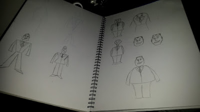
I continued to work on the pose and expression sheets for my character design. Once I got going I was enjoying it much more. I just struggled to think of poses. Most of them are quite simple arm movements because his weight restricts his motion. I did one with his hands on his hips because I think he is quite a grumpy and sassy person. I then have him with his hand out. I imagined this as his 'tickets please' pose. Then one of him waving his hat as a signal or something of that nature. This one was when I realised that I'd not thought about what exactly was under his hat. I then also did one of him sat down. I decided that because he was so big. His legs would point straight out rather than bend at the knees. Him being a train conductor means there aren't many other poses that I could think he would be doing.

Most expression sheets are much more expressive and show a wider range of dynamic poses. This lets the artist and animators see how far they can push the characters movement. They can see how much it will squash and stretch and how fluid they will be. My character isn't a very expressive character so it works that he isn't showing many dynamic poses because he wouldn't be doing much anyway. 


The expressions were more fun to play with because his fat chin and jaw are more easily movable. His jaw is one big entity to just move under so it doesn't matter how his mouth moves. 

I really enjoyed creating this character once I got going. I think I've struggled with it because I wasn't enthusiastic about the idea for my character. I wasn't entirely invested in making him which made it much harder to stay motivated and actually do it. It became much better as I went along when I started to feel more confident with what I'd created. I started to enjoy it much more. I'm pretty happy with my character even though I'm still not entirely keen on the idea he's based on. I'm not too sure how effective he is as his conductor character as many people have mistaken him for a policeman. In hindsight, I should have probably added some more distinguishable features that really hinted towards the train conductor character.

Sunday, 22 January 2017

Visual Language: 16th - 22nd January 2017

This week was quite heavy with finishing off all my character design stuff. I loved doing the animated character turnaround. I loved to be animating again.

I did some research into industry turnarounds and character sheets. I love looking at this kind of thing because it's really interesting to see how the characters started out and what the animators used as reference to make sure the character is consistent. The most important thing from any of these kinds of character turnaround sheets is the proportions. The character needs to always look like the same person. 

I used Adobe Animate to create this as it is a program I am comfortable with and it allows me flexibility in my drawing. I can still tweak and edit things much easier. I used a circular guide on the ground to base my perspectives from. At first this was a bit tricky but being able to tweak proportions as I go really helped and I did soon get the hang of it and all my guides were incredibly useful and really sped up my workflow. 

I planned this out quite extensively by first creating a shape skeleton version, then a sketch version and then the final line work. This let me make sure that everything looked correct before moving on to more detail. This worked really well for me as I believe I have managed to create the three dimensional look of the character staying in proportion. 

I'm really happy with my finished turnaround. I've not done an animated turnaround before now. I've usually just done front, 2/3 and side as my turnarounds so this was really fun to make. Also it was just great to actually do some animation again. 

Through the rest of the week I started work on the pose and the expression sheets. I found it difficult to think of poses that this character could do. With him being so big and round, it made it hard for me to actually create poses because there isn't much room for him to move. This is something that I didn't think about when designing him and I think that while is immovability does tie in with the kind of character he is because of his shape, it does restrict him rather a lot. His face is less restrictive allowing me to create a greater range of facial expressions though I feel like his character would be grumpy most of the time so I wanted to also try and communicate that in different ways too.

Sunday, 15 January 2017

Visual Language: 9th - 15th January 2017

Over the Christmas break, I'll admit they I didn't get as much done as I would have liked. I did some more research work and a bit on my character design. 


I started to refine my character much more. I still wasn't completely happy with it but I stuck it out and I am actually growing to like him the more I draw him. I moved on to creating my sketches on Photoshop. This was I had more freedom to play around and tweak as needed. I can just keep playing around with proportions to create something I liked. 


Doing this worked so much better for me and I quickly started to like my character. I did try a slight costume variation but then decided that I didn't really like it as it didn't look as identifiable as a train conductor. I am very happy with the small detail of adding a ripple chin. This was something that I just started adding in my last few sketches but I really like it. It gives some more visual interest and adds to the silhouette of the character. 


Once I was happy with my design, I then started working on the t pose character sheet. This is something that I always really liked doing because it's the first time that the character comes together properly. I did this in Photoshop to again give me more flexibility. I started with the geometric shapes, then a sketch version of the character and then the final line work. 

The colour was added layer by layer on a clipping mask that filled the shape of the character, this let me easily alter any of the colours of individual elements. By also creating the shading on a layer above on 30% opacity, I could still play around with the colours and the shading would automatically change with the base tone.


The final colours are actually the ones that originally came to mind. This is influenced by the uniforms the conductors on the northern rail trains that I get on. I did a hand full of colour variations to try and see if I liked any others but in the end the first was still my favourite.


For creating the other poses, I copied the base shapes from the original sketch and created the profile view first. I find that doing the front and profile views before the 2/3 or 3/4 views is much better to manage and keep proportions. This is because I can then create the middle pose as I would do an inbetween frame. I lowered the opacity of the previous angles and just drew in between. 


I am actually really happy with how this design has turned out. I think was hard for me to get into to begin with because I felt like I was doing the process backwards since we had to create a character from the backgrounds we drew. I grew to like it the more I drew it but I do still think it would have been more natural and easier to be invested in if it were done in the order of thinking up an idea for a story before starting to just design the elements outright. I am looking forward to creating the animated turnaround next.

Sunday, 11 December 2016

Visual Language: 5th - 11th December 2016

I continued to work on designing my character but I was starting with the face and creating various shapes and features. I knew that I wanted the facial features to be rather small on his head in order to reinforce his size and weight. This way felt much more natural and comfortable to create my character. I started to really enjoy the big bean shaped head with the big fat chin. This made an interesting silhouette to the character. He is starting to resemble the likes of Family Guy's Peter Griffin and The Simpsons Homer Simpson with his shape and silhouette.

The Tuesday was our interim crit on our environmental drawings. I was told that my lines and shapes were very strong and well communicated the shapes. I was then told that I didn't actually have enough images so I will have to draw some more on my commute. Colour was something that I was planning to do digitally and this is what was suggested most as well so that was ok. That was the only things that I really received from this crit. I don't feel that this way of presentation for a crit works as well. When we put our storyboards around the room and people put sticky notes on, we gained more useful feedback in a fraction of the time. People are less inclined to shout out to give feedback in a presentation.

After this crit I will have to do some more environmental drawings. I will try to use a wider range of media and think about the colour I use. I will also be scanning in my drawings and digitally colouring them in different ways.

Sunday, 4 December 2016

Visual Language: 28th November - 4th December 2016

After completing my animation skills animation and responding to the feedback in our crit, I could then put my focus onto this character designing much more. I started fresh.

I started by going online and simply searching for some inspiration. I looked at commuters and trains and the like, and this is some of what I found. 


This kind of exercise is always pretty helpful to me. After looking at many of the stock images I gathered, I thought about the conductor doing the same thing every journey. The people could be different every time but there is always that consistency. I thought that I could do a story of the conductor. He could be going around collecting tickets as normal, but when there is someone who is taking forever to find theirs, he just snaps and throws them out of the window onto a platform. This way, I could make use of the backgrounds on platforms that I've also drawn. 

I tried to collect some more stereotypical thoughts of train conductors. What I first think of is a rather large man, maybe a bit sweaty, shirt and tie, pens in the pocket and typical conductor hat. Actually, a simple idea of what I think about goes back to the fat controller on Thomas the Tank Engine. 

As I was much happier with this idea for the character, I then went on to experiment with geometrical body shapes and silhouettes. These shapes weren't too dissimilar to what I created for my original idea. I want to go forward with the rounded shapes but I want to break away from being too close to the fat controller. I struggled with this as all my ideas seemed to be very similar. I just wasn't liking what I was making. I think that the method we had been told to use in order to develop our character just doesn't work with me. This isn't how I like to make characters so I will try to go about it how I usually do.

Sunday, 27 November 2016

Visual Language: 21st - 27th November 2016

When starting on the character design task, I was a bit unsure of what to do. Using the scenery of the train as inspiration, I was trying to think of a type of character I could create from that. I saw the typical businessmen kind of people who commute and thought of doing something like that.

I messed around with basic geometric shapes to try and communicate this idea. I was going for creating a salesman that was overly enthusiastic. Trying to communicate this wasn't really working for me. I didn't feel very good about any of these ideas or shapes. None of them really stood out to me. 

Using this method of creating shapes to influence the characters design is a very common thing throughout animation and film. By creating a character that resembles a certain shape, you can instil certain feelings and judgements about them. This video covers this topic in quite an interesting way. https://youtu.be/lLQJiEpCLQE The key ideas from this are that if there are lots of circles in the character, it means they are generally nicer and more lovable as they create a soft shape. The flip side to this is that the sharper the angles used, the more dangerous and cruel they usually are. These principles influence how we see a character and what we think about the type of person they are, so I am trying to keep this in mind through the process. 

I didn't do all that much more on my character design stuff this week as I was really crunching on completing my animation skills 15 second animation. I think that I need to come up with a new and more interesting idea for a character because I am really not feeling enthusiastic about this at all. I need something that will give me more to play with with more interesting and with more room for changes and individuality. 


CHARACTER DESIGN USING SHAPES https://youtu.be/lLQJiEpCLQE

Sunday, 20 November 2016

Visual Language: 14th - 20th November 2016

Continuing on with my enviroment drawings, I did another in the Leeds station. I went upstairs since this is somewhere that I don't often go because of the platforms my trains usually go to. I sat down at the end of the big pathway and attempted to draw across to the other side of the station. It was very cold here and there were lots of people constantly blocking my view. I didn't spend very long on this because I just wanted to go home. I did, however, later that night, make the main lines much bolder to make the shapes stand out more. 


I did another quick one at my hometown's station. There are no benches here and the only shelter doesn't allow for any interesting composition, so I leant against the fence further down the line. Since it was incredibly cold, I wanted to get this one done very quickly. To aid in this aesthetic, I chose to use a marker instead of a pencil to get more sporadic and expressive lines. I feel that both of these look rather messy because of how my hands couldn't stop shaking. 

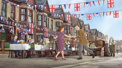
After attending Manchester Animation Festival, and seeing Ethel and Ernest, I was in love with the style and use of the backgrounds. This is done in pretty much the same way as I talked about with Treasure Planet, but the 3D backgrounds in Ethel and Ernest have been painstakingly drawn over to achieve the same soft water-colour painted style as the characters. While it is still easy to be able to tell which are 3D rendered backgrounds, this does help them blend with the characters. This technique is used mainly for panning or tracking shots where the background is rather geometric, like buildings and roads. 

Another example is the backgrounds used on the classic Disney film. These backgrounds were all more painted and had a great look and texture. This always makes a great looking contrast between this and the black outlines characters. I like how they will paint a big background that allows them to pan across it as a panorama to create a big scene that can sometime achieve a subtle and simple 3D effect. 


These drawings weren't all as bad as I was expecting. I've never been confident with backgrounds and dynamic angles and compositions but I feel that this task has been somewhat helpful for me in choosing more interesting looking backgrounds. Focusing more on the shapes rather than details will help in creating brand new backgrounds.

Sunday, 13 November 2016

Visual Language: 7th - 13th November 2016

This week I made a start on my environmental drawings. Originally, me and a few others were planning to drive to brimham rocks and draw them since they are very interesting and unusual things. We never got around to going and then also it would simply be just too cold to keep going. After that I was struggling with where to go and where to draw. I had considered drawing the interior of the pub that I work in but I would have felt far too uncomfortable doing that. 


For my research into backgrounds and interesting compositions, I started looking at Treasure Planet. I have always loved this film and it's use of 3D backgrounds with 2D characters. Since they modeled backgrounds in 3D, it allowed them the freedom and flexibility to play around with compositions a bit more, but also to achieve some more interesting and impressive shots even with complex elements within. The style creates a contrast against the linework of the characters which I think is quite appealing. The 3D elements do almost look too smooth because they don't have the slightly choppy and personal feel of the hand-drawn 2D elements.

I eventually decided that, since I commute to and from uni every day, that I could just draw the interior of the train and the train stations. While I did still feel quite uncomfortable drawing with so many people around, at least I didn't know them, so that made it better. 

I made an effort to try and draw 1 drawing per journey home (30 minutes), so it gave me a time limit and stopped me from adding too much detail and instead, focusing on the shapes and composition. I also did a few while waiting at the platforms. I also sat down at the pub in the train station and drew the view of the ticket gates. As I was focusing on the environment, I had to draw what I could see when I could see it since there were so many people blocking my view. When drawing certain areas, I had to wait for a glimpse through the crowds to see what was behind. Because of this, it may be somewhat inaccurate in proportions but believe that I succeeded in making it recognisable in what it is. 

I did this same thing with the train itself. I didn't want to draw the people sat in the chairs so I used the empty chairs as a reference to draw the ones that were obscured from view. Doing these environment drawings hasn't been as bad I was expecting it to be. I get very uncomfortable drawing when people are around but I think that having actually done it, I found it easier to stop worrying about the people around me and just focus on the drawing itself. 

Sunday, 6 November 2016

Visual Language: 31st October - 6th November 2016

This week I finished my rocket task. This was difficult for me to finish. I found it incredibly hard to find the motivation to finish all 24 drawings and then the next 12 and storyboard. 

I am proud of my work on the 12 final pieces as I could then refine them into doing something that I actually enjoy doing, therefore creating better work. I do feel that these vector art rockets are much better than any of the other rockets I created. I started messing about with more simplistic vector art using silhouettes and I feel that these worked quite well. I really like the look of these. 

I am always happier with what I can create on computer over anything practical. This is obviously something that I do want to work on but mostly, my proudest work is done on computer. Also work that I simply enjoy doing more, and I think it's very important to enjoy what you do otherwise what is the point? I do need to work more traditionally more often in order to keep building my skills.

Overall, I have to say that I didn't really enjoy this task. I found it incredibly tedious and I just couldn't get motivated to do it. I am happy with some of the later rockets I made but I am still very pleased that we are now moving on from this. I do understand why it was useful and why we did it. It was a tricky exercise that has worked to make me really think about how one word can be interpreted so differently. 

Sunday, 30 October 2016

Visual Language: 24th - 30th October 2016

This week I continued to work on my 24 drawings task.

I was struggling quite a lot to get really motivated. I couldn't really think of many ideas for different rockets or methods. I haven't really been liking this little project for this reason, but then that has been making it even harder to actually do it. I think it is also harder for me because I am so excited to do the new animation skills task and I have so many ideas that I just want to do that. I've been trying to make myself finish this before I make a start on that though.

I felt that I had really run out of ideas. It wasn't helped by the fact that I had been doing all my drawings up until this point at the wrong size. I had been using a very small sketchbook as I thought that was what was said in the briefing. I had gotten confused and was going off of something else that was said and the brief did in fact say that they should be done in A4. So because of this, I redrew all of the prior rockets into an A4 sketchbook. I can make sure that this kind of thing doesn't happen again by thoroughly reading the brief again and asking questions to make sure I am totally clear on what to do. 

It was a really hard slog to make myself finish this off as I really wasn't enjoying it. I am happy with some of the pieces that I have made throughout this series of drawings but all in all it's been a struggle for me. I have just been really wanting to move on from it.

I like the idea of the new environments briefing. I am excited to start drawing places using perspective points. This will be a very useful thing for me because I am not confident with creating backgrounds so I really hope to improve through this. I am not sure yet where I will draw but hopefully I will make a start on this task soon. 

Sunday, 23 October 2016

Visual Language: 17th - 23rd October 2016

After receiving the brief, we each picked a random word to use as our stimulus. The word that I ended up with was 'rocket'. I was pretty happy with the word that I had been given. I felt that this had a lot of potential to make cool variations upon. First I googled the word to try and see any of the possible other ways that it could be interpreted other than the obvious, rocket ship. 

I found rocket leaf, rocket launchers, rocket raccoon, and many other ways of using the word, all of which I wrote down in my spider diagram before starting on anything else. I don't feel as though I have done all that many. I know that I do work slowly and this is something that I am trying to improve on. I attempt to work more impulsively and experimentally, without worrying about what the outcome may look like and just doing it anyway. 


One of my favorite drawings so far is the tonal Biro pen piece. I really like these line shading styles and the depth they can give so I was quite happy with my attempt at this style. I do feel that I could have done a better job with consistent proportions, perhaps I will create another space shuttle like this later in the book.

For the drawings I have left to do, I will also try to be more experimental and use different materials and techniques. I feel that I have been using pencil too much as this is my favorite practical media. I'll see what other techniques will help me achieve. I am making an effort to try and think outside of the box to come up with more inventive ways of thinking about 'rockets'.