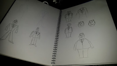
 I messed around with basic geometric shapes to try and communicate this idea. I was going for creating a salesman that was overly enthusiastic. Trying to communicate this wasn't really working for me. I didn't feel very good about any of these ideas or shapes. None of them really stood out to me.
 Using this method of creating shapes to influence the characters design is a very common thing throughout animation and film. By creating a character that resembles a certain shape, you can instil certain feelings and judgements about them. This video covers this topic in quite an interesting way. https://youtu.be/lLQJiEpCLQE The key ideas from this are that if there are lots of circles in the character, it means they are generally nicer and more lovable as they create a soft shape. The flip side to this is that the sharper the angles used, the more dangerous and cruel they usually are. These principles influence how we see a character and what we think about the type of person they are, so I am trying to keep this in mind through the process.
I didn't do all that much more on my character design stuff this week as I was really crunching on completing my animation skills 15 second animation. I think that I need to come up with a new and more interesting idea for a character because I am really not feeling enthusiastic about this at all. I need something that will give me more to play with with more interesting and with more room for changes and individuality.
CHARACTER DESIGN USING SHAPES https://youtu.be/lLQJiEpCLQE
No comments:
Post a Comment