I did another quick one at my hometown's station. There are no benches here and the only shelter doesn't allow for any interesting composition, so I leant against the fence further down the line. Since it was incredibly cold, I wanted to get this one done very quickly. To aid in this aesthetic, I chose to use a marker instead of a pencil to get more sporadic and expressive lines. I feel that both of these look rather messy because of how my hands couldn't stop shaking.
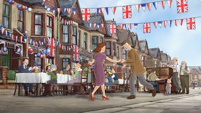
 After attending Manchester Animation Festival, and seeing Ethel and Ernest, I was in love with the style and use of the backgrounds. This is done in pretty much the same way as I talked about with Treasure Planet, but the 3D backgrounds in Ethel and Ernest have been painstakingly drawn over to achieve the same soft water-colour painted style as the characters. While it is still easy to be able to tell which are 3D rendered backgrounds, this does help them blend with the characters. This technique is used mainly for panning or tracking shots where the background is rather geometric, like buildings and roads.
 Another example is the backgrounds used on the classic Disney film. These backgrounds were all more painted and had a great look and texture. This always makes a great looking contrast between this and the black outlines characters. I like how they will paint a big background that allows them to pan across it as a panorama to create a big scene that can sometime achieve a subtle and simple 3D effect.
These drawings weren't all as bad as I was expecting. I've never been confident with backgrounds and dynamic angles and compositions but I feel that this task has been somewhat helpful for me in choosing more interesting looking backgrounds. Focusing more on the shapes rather than details will help in creating brand new backgrounds.


No comments:
Post a Comment