Monday, 13 February 2017

Process and Production: Research 2: Tex Avery

Someone that I really admire a great deal when it comes to animation and visual comedy is Tex Avery. Avery was one of the main leading directors of the Looney Tunes and a very influential animator from the golden age. He was a major part of creating and/or popularising and developing characters such as Porky Pig, Bugs Bunny, Daffy Duck and Droopy. 

His use of exaggeration was incredible as he took it to a new level that no one had really done before. He stretched his characters further than anyone would think to try. He had some really great ideas of how to convey emotions in very comical and visually interesting ways. By expressing the characters in such an absurd way it added a extra shock value to the moment, often catching the audience off guard, hence making them laugh. 

This example shows how he communicated a moment of extreme shock. Instead of just widening the eyes and opening the mouth, he made this characters limbs detach and fly off the body for a moment as the whole character hovers in the air. 

He wanted to make cartoons that could appeal to adults as well as children. There was something for everyone in his films. He frequently broke the 4th wall with his characters addressing the audience directly or popping up in the credits. This made the characters seems more real and was a very new and interesting use of them. 

Sunday, 12 February 2017

Process and Production: 6th - 12th February 2017

Unfortunately due to train delays, I missed the crit session itself, however I did show people my animatic later on and got some good feedback.

I received quite a few positive comments about how the establishing shot and the ambient sounds set the scene quite well and the expressions being funny. 
The main thing I was told could be improved was making the moment when he hints to the champagne a bit clearer. This can be easily fixed by just swapping the audio for a take where 'champagne' is a bit clearer while still carrying the nervous voice. This also comes to my audio mixing which I haven't done properly yet. So from this feedback I can work on making the moment a bit clearer to understand.

After this I got to work in creating the background for the opening and final shots. I knew that I wanted to do a bit more of a detailed background this time, but I also liked the idea of making it somewhat sketchy and textured.


I looked at backgrounds from many classic animations, focusing mainly on the painted style ones. I really love the contrast of background to characters, especially when black outlines are not used on the backgrounds. This creates a great difference between what we should be focusing on. 

I built the background in a way that would let me easily create a subtle 3D perspective effect. I'm incredibly happy with how this effect turned out. I exported 5 separate .png images to work with in creating this effect. The 1st was the backing wall and decorations followed by the 3 layers of tables and then a light bloom effect coming from the lights on the roof. Each of these was animated enlarging slightly more than the last to create the effect that the camera was moving through them. I then also added a subtle blur to sell the depth of field. 

In Adobe Animate, each of these layers were made into their own symbols so that I could go into them and animate anything inside. So for example, I went into these symbols to add the main character and silhouettes while keeping the movement and depth of field consistent. These images are also linked with photoshop so that I can always go back and edit the colours or textures. I will also have to make a variant of this scene towards the end where I can animate the chair falling backwards onto the floor.

This week we also got briefed the pixilation task. I have only done pixilation a few times before so I'm quite excited to do this. I want to really use the medium to my advantage by creating something that couldn't be done normally. I had an idea for animating someone punching someone and them sliding all the way down the hallway and slamming into a wall. I will keep thinking up ideas before I eventually create it as I think I need to make a bigger start on the main task before I can do anything else.

Wednesday, 8 February 2017

Process and Production: Research 1: The Golden Age

The Golden age of animation was a period from approximately 1928 until the 1960's in which the animation industry really picked up in the mainstream media. Animation became incredibly popular and the techniques advanced faster than ever before. This era introduced a great many iconic characters and invented and refined the 12 principles of animation. 

The era started roughly with the release of 'Steamboat Willie' in 1928. This was a big deal in terms of mainstream animation innovation. This was very popular and was one of the first animations to include synced sound. Disney became one of the key driving forces of animation as a media. Many animated shots were made involving a wide range of new characters that have become staples of the animation genre in general. 

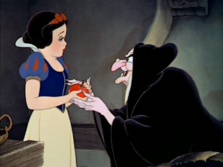
The first big feature film of this era, and possibly the main key event kicking off the golden age, Snow White and the Seven Dwarfs was released in 1938. This was an incredible achievement and started a long line of classic Disney films to come including Pinocchio, Cinderella, Sleeping Beauty and many more. These animated features took an awful long time to do, weren't cheap to make, and rarely made a profit but they are incredibly well loved films and have amazing animation skill with innovative use of techniques and processes.

The 12 principles of animation, while not officially stated until the 1981 book 'The Illusion of Life', were created and used by the 9 old men of Disney and have gone on to be the fundamental laws of physics within the animation industry. These terms are used between animators as a common language so everyone knows what to refer to when talking about the work. 


The golden age started to fizzle out when interest shifted towards live action films. The animation industry was becoming harder to sustain and much harder to break even on films. The era really took the biggest kick when Walt Disney died in 1966. The company really struggled to come back from this for a long time, making films that were rarely box office hits, though adored by fans and critics. This also had a rather big impact on the animation industry in general, with audience demand lessening. 

This era of animation produced some of the greatest animated classics ever. It was a time of incredible progress with the techniques used to create animation. Possibly the most prominent thing to come from this era are the 12 principles because they have been the guidelines for so much mainstream animation since. 

Sunday, 5 February 2017

Process and Production: 29th January - 5th February 2017

I got to work designing the two main characters. I started with drawing out a variety of head shapes. This was rather enjoyable and something that I developed upon through the visual language module. However I still didn't want to spend too much time on this because this animation is very ambitious and I want to leave myself as much time as possible to work on that side of the project.

The thing that I really struggled with in this was designing a hair style for the man that I liked. I wanted something that wasn't too tidy and well kept in order to show that he was a bit clumsy and careless. I started to like the shaved sides but I wasn't fond of much of the stuff I created for the top of his head. I wanted something that could be a bit floppy to help me show motion but also I didn't want it to be too detailed since I am going to be animating lots of really expressive frame by frame motion.

I eventually settled on the one with three simple strands hanging down and the rest being neat and more simple to draw. This gives me something to move around to accentuate the motion. I decided on the design for the woman very quickly. I was pretty happy with just the first few drawings and so I decided to roll with that since she wasn't featured as heavily as the man.

Once I'd finished these it made it much easier to do the storyboard. I made sure to try and add detail of the characters to act as a good reference. I used many frames in this storyboard, more than I usually do. I made a new drawing for the main key poses I could think of. This is much more detailed and helpful as a reference when I come to animating and it also makes the animatic much simpler because I have already drawn the main keyframes. 

I scanned in my sticky notes to use for the animatic. I timed them up to the text files I'd made before and as expected they had to be tweaked to feel more natural. I then took this to the sound studio and brought in two people to record the voices. I described the kind of sounds and reactions that I was thinking about but also just let them play around with it. I let the video loop and asked my voice actors to just keep doing many takes in time with the video. This worked very well since I had many options to use when editing. I cut together a few different bits from different takes for the final thing. 

I'm really happy with this finished animatic. I think that it does communicate what is happening and the voices and sound effects really help that along. I will have to go back through and properly mix these to make sure the important bits can all be heard over the ambient sounds. 

Sunday, 29 January 2017

Process and Production: 23rd - 29th January 2017

This week I made a proper start on the actual pre-production of my animation. I was refining the idea as I made my timed plan in Premiere. I used title files as the descriptions of each shot and timed them up to the space that would feel natural. I made sure that the duration reached at least 25 seconds but I did have to go back through and trim it down a bit since it was too long. When I actually come to creating the animatic, I expect these timings to change a bit again since I will have a clearer idea of the visuals.

After doing this I was much happier with the idea I had, but I do need to do some more research for the visual elements that I want to work with before I start. I also need to design the characters enough to do the storyboard and I can then refine them again before I start the actual animation. Since I want to create this animation to have very over exaggerated expressions and movements, I am putting more time into the pre-production by means of the expression sheets. These will be really important to me when animating.

The target audience that I am aiming for is young people - teenagers, though I believe that people of any age could still enjoy it because of how subjective humour can be. It is the same with Looney Tunes. Though it is intended for kids, people of all ages can still watch it and enjoy it. The visual slapstick comedy allows for a wide target audience. Obviously the age range affects how severe the slapstick can be. For younger audiences, it can't be very gory or anything like that. Cartoons exist in a unique place where they can experience extreme circumstances that would kill anyone else, but because they are cartoons, they can just survive anything the writers want them to. The classic example is that of an anvil being dropped on the toons. Depending on the target age, this could be very silly or incredibly gory.

I'm hoping to work on creating the characters this next week once visual language is finished. 

Visual Language: 23rd - 29th January 2017

I continued to work on the pose and expression sheets for my character design. Once I got going I was enjoying it much more. I just struggled to think of poses. Most of them are quite simple arm movements because his weight restricts his motion. I did one with his hands on his hips because I think he is quite a grumpy and sassy person. I then have him with his hand out. I imagined this as his 'tickets please' pose. Then one of him waving his hat as a signal or something of that nature. This one was when I realised that I'd not thought about what exactly was under his hat. I then also did one of him sat down. I decided that because he was so big. His legs would point straight out rather than bend at the knees. Him being a train conductor means there aren't many other poses that I could think he would be doing.

Most expression sheets are much more expressive and show a wider range of dynamic poses. This lets the artist and animators see how far they can push the characters movement. They can see how much it will squash and stretch and how fluid they will be. My character isn't a very expressive character so it works that he isn't showing many dynamic poses because he wouldn't be doing much anyway. 


The expressions were more fun to play with because his fat chin and jaw are more easily movable. His jaw is one big entity to just move under so it doesn't matter how his mouth moves. 

I really enjoyed creating this character once I got going. I think I've struggled with it because I wasn't enthusiastic about the idea for my character. I wasn't entirely invested in making him which made it much harder to stay motivated and actually do it. It became much better as I went along when I started to feel more confident with what I'd created. I started to enjoy it much more. I'm pretty happy with my character even though I'm still not entirely keen on the idea he's based on. I'm not too sure how effective he is as his conductor character as many people have mistaken him for a policeman. In hindsight, I should have probably added some more distinguishable features that really hinted towards the train conductor character.

Sunday, 22 January 2017

Process and Production: 16th - 22nd January 2017

After continued thought on developing my idea, I decided that I really liked the idea of really over exaggerated facial expressions in order to tell the comedy of the moment. I think that if the man was to put the ring in her glass and then hints to it by nodding at it, then she could look happy and surprised but she means about the champagne that she hadn't noticed. She would then proceed to drink it and swallow the ring whole. The man could then look at her in shock at how she didn't notice the ring (perhaps his jaw could slam into the table to exaggerate the shock).

I am liking this idea much more and so I looked into more uses of exaggerated visual comedy in order to influence my ideas.
I will still be trying to think of more ways to develop my idea and add more humour into it. 


I'm thinking about making this similar to a silent comedy and use the over the top expressions to tell the story and humour. The first thing that came to mind when thinking of the tone and style I want to create was the work of Chuck Jones on Looney Toons. His use of character to create visual comedy is, in my opinion, some of the best. Though I know that I like this kind of stuff, I need to analyse it more in order to understand it enough to be able to apply it to my ideas. 

I think after a bit more researching, I could make a text animatic to just get a guage on timings. This is something that always helps me to plan out the pacing of my initial idea before anything else so I will compile this as I think of more details.